How Colour Defines a Successful Brand? - Website Design Company Dubai - VCode

How Colour Defines a Successful Brand?

Colours are more powerful than you think… The colour if an icon can actually make you click, the colour of a dress and compel you to purchase it. Colour can say a lot about a brand and the audience they are trying to target, like gender, age, flavour and much more. Science has proven that colour has the power to prove emotions, so using the colours strategically for your marketing efforts, you can get your audience to see what you want them to see and help them perceive you the way you aim to be perceived. For a reason, it is crucial to understand the colour psychology and use it effectively to market your brand.

You may also like:

What Is Colour Psychology?
Colour psychology is a study of the relationship between human behaviour and colours. The aim was to study the effects of colours on everyday purchasing decisions. And surprisingly, colour does play a huge role in why people prefer certain products over others. Similarly, there is a smart use colour strategically behind every successful brand. And yes, some brands can fail because of wrong selection of colours. The right selection of colours can portray your brand correctly.

Similarly, poor colour selection can do damage to your brand image. For instance, if you choose the wrong colours for your content or logo, it can turn out to be less readable and hard for your audience to understand. Or you can risk being ignored altogether.

What Can Colour Indicates About Your Brand?

As stated above, colours have the power to provoke emotions. As a brand, you want to cultivate a strong emotional connection with your customers. The problem is you can’t tell your company’s entire life story in a logo or storefront—but branding colours provide a shortcut straight to your clientele’s hearts.

Colours are divided into two main categories, warm and cool. Warm colours are often represented as energetic while; cool colours are associated with calmness and security. But how do each of the following colours affect us, and what does that mean for your brand? Here’s an overview of what differentiates each colour and how your brand can pick the right mix of them.
Red

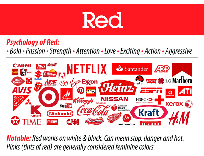
Red is used for capturing attention as this colour is associated with excitement, passion, danger, action and energy. Most of the time it is used to display order now button, to capture the attention. It is considered as the most intense colour in colour psychology the ability to provoke strong emotions. Thus it works best when used with a call to action.

Green

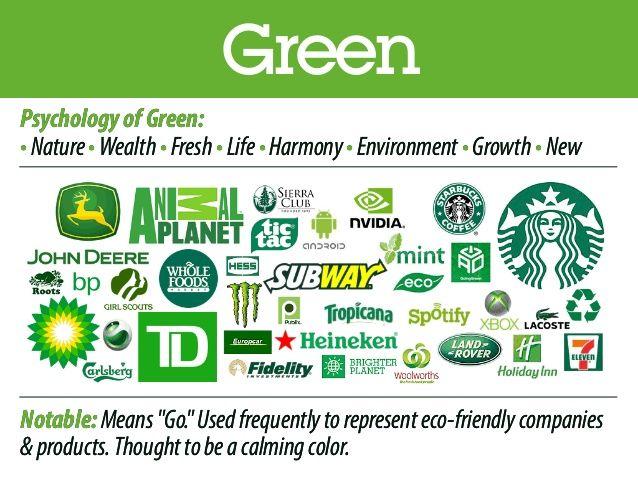
Green represents nature, money, growth, fertility and health. Despite having so many positive meanings, it can also carry some negative associations such as envy. Highly suitable for health and fitness-related businesses or organic stores love to add more green to their website. Even if your brand is not directly associated with nature, you can add green to your logo to show association with nature.

Blue

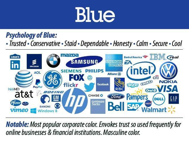
Bule is the colour of sky, and sea and represents stability, harmony peace, calmness and trust. However, blue colours meaning is limitless, just like the sky, and it always generates positive vibes when used in your brand elements. Bule suits best on almost every website top navigation menu. Some retailer businesses add their guarantee, trust certification or free shipping icons in a blue colour to strengthen the trust aspect the colour is known for.

Purple

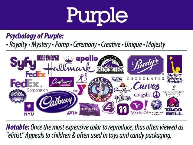
Purple has always represented royalty. It is often referred to as power, luxury, nobility, wisdom and spirituality. But to much use of this colour can also create a feeling of frustration. Some perceive its overuse as arrogant. You can add hints of purple to your website’s design such as on your free shipping bar, your logo, and as an accent colour in your graphics.

Grey

As grey is a middle colour of two extremes, white and black it represents neutrality. However, grey does carry some negative connotations, particularly when it comes to depression and loss. Its absence of colour makes it dull. Grey can be used for font colour, headers, graphics, and even products to appeal to a mass audience.

Orange

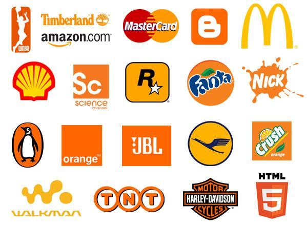
Orange colour is used to add fun to any picture or brand. Colour psychology associates it with enthusiasm, adventure, success and balance. It is one of the most attractive and commanding colour after red. It can also be used with a call to actions or where you want to draw your visitor’s attention. Mostly brand which wants to show energy and enthusiasm use it in their logo.

How Important Is To Select The Right Colours For Your Logo?

The logo is the most important element for any brand. It represents the whole brand identity, and choosing the right colours is always difficult. To determine the right colour for your logo, you need to understand what your brand wants to convey to your customers and examine your brand personality. You need to think your brand wants to be known for and convert that message into colours. By choosing the right colours for your logo, you can successfully develop a relationship between the brand and the audience, which plays a huge role in any brands success.

Role of colours in website Design

The website is the digital face of your business, and it plays a huge role in the success of any business. If you are thinking to impose the theme of your physical store on your website, it might not get successful. For instance, while red is commonly used to evoke feelings like passion and excitement, it might come across as too bright if it is not used appropriately on a website. So it is important to alter the colours of brand identity to suit your website.

Conclusion

Choosing the right colour for your brand depends on many factors, and the niche of your business is one of the most important among them. If you are still confused about selecting the right colour for your brand identity, logo, or website get in touch with the experts at vcode.